

Pepsi rebrands with new logo

When it comes to iconic brands, one of the major elements which make their brand unique and easy to identify is their logos. The likes of Nike, Mcdonald’s, and Apple are among the most recognisable around the globe, and Pepsi is also in that category.
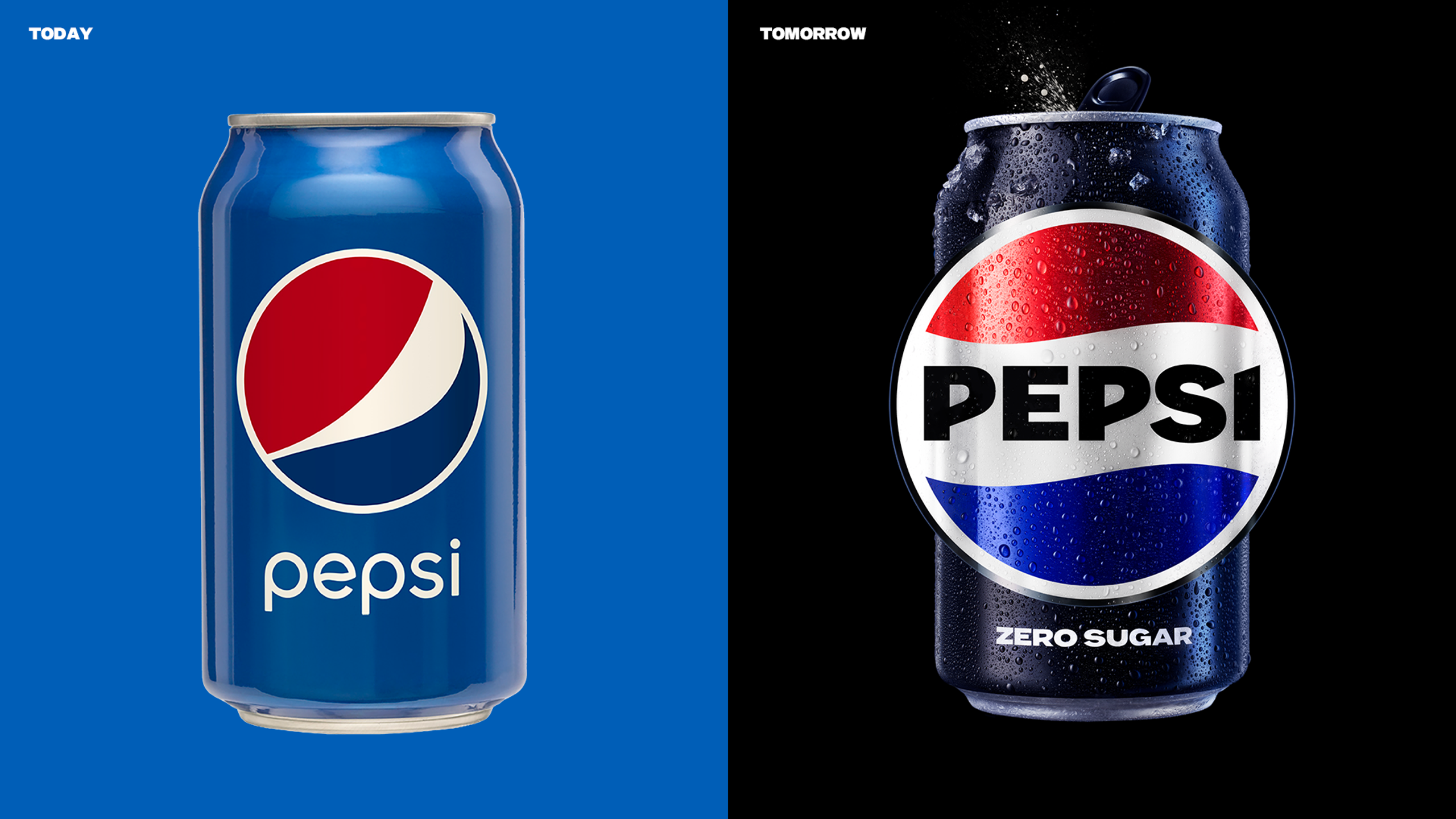
After 14 years, Pepsi has revealed its new logo as part of its rebrand to usher in their “new era”.
Their famous colours of red, blue, and white are the most recognisable in the beverage industry, and whilst they remain part of the logo, the logo and visual identity “borrows equity” from the brand’s 125-year history, Pepsi says. However, the rebrand will feature a new colour palette, which will now include the colour black. Whilst Pepsi’s logo for many years has featured a more modern font for the word “Pepsi”, the new logo sees more of a retro look from the 1970’s to 1990’s; with the brand name in a bold typeface.
The new logo is set to roll out in the Autumn of 2023 in North America, in line with the brand’s 125th anniversary. It will then be rolled out globally in 2024.
Not only will the new branding be visible on physical packaging, but it is set to span across all digital touchpoints also. The new identity has been specifically designed to appeal in an “increasingly digital world”, Pepsi says, introducing more “movement and animation” and “unlocking more flexibility” in its branding.
Brand distinction and aiming for success in an “increasingly digital world” is the reasoning behind the rebrand; according to Chief Marketing Officer, Todd Kaplan.
“Pepsi is an iconic brand that is constantly evolving with the times, as it has been a staple in pop culture and disrupted the category for the past 125 years. This new visual system brings out the best of the Pepsi brand’s rich heritage, while taking a giant leap forward to set it up for success in an increasingly digital world.”

